Nx Platform Overview
Dashboard Filters, Queries and Customization
Workflow Overview
Dashboard Customization
Nx allows different users to leverage the same, shard dashboards, but allows for local customization to deliver a personal view and experience for how each user prefers to organize their dashboards. Below are some of the tools to easily customize your Nx dashboard.
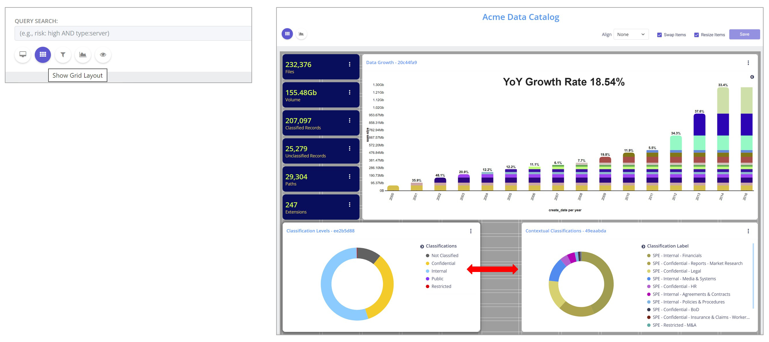
Grid Layout
Click on the Grid icon under the query bar to rearrange or move the various analytical tiles to fit your preferences. You can now adjust each tile as needed. When finished, click Save to preserve your edits or click on the Grid icon again to disregard any changes.
Update Dashboard
This feature allows you to save custom dashboard views to preserve either a single filter or with a combination of applied text queries and filters by clicking Update Dashboard under the query bar.
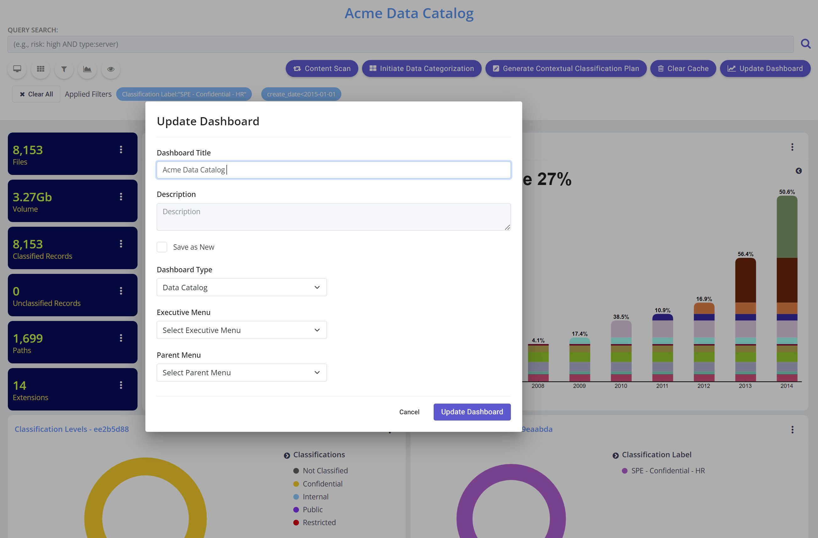
Please note: The updated dashboard view is unique to the user account. Your fellow team members will not be able to see your dashboard updates.
Presentation Mode
For cleaner look, click the Computer icon to turn presentation mode to hide the side bar and menu.
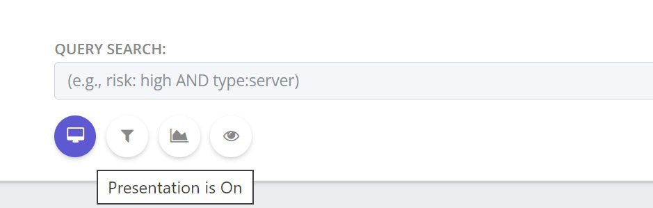
To go back to the non-presentation mode, click on the same icon again.
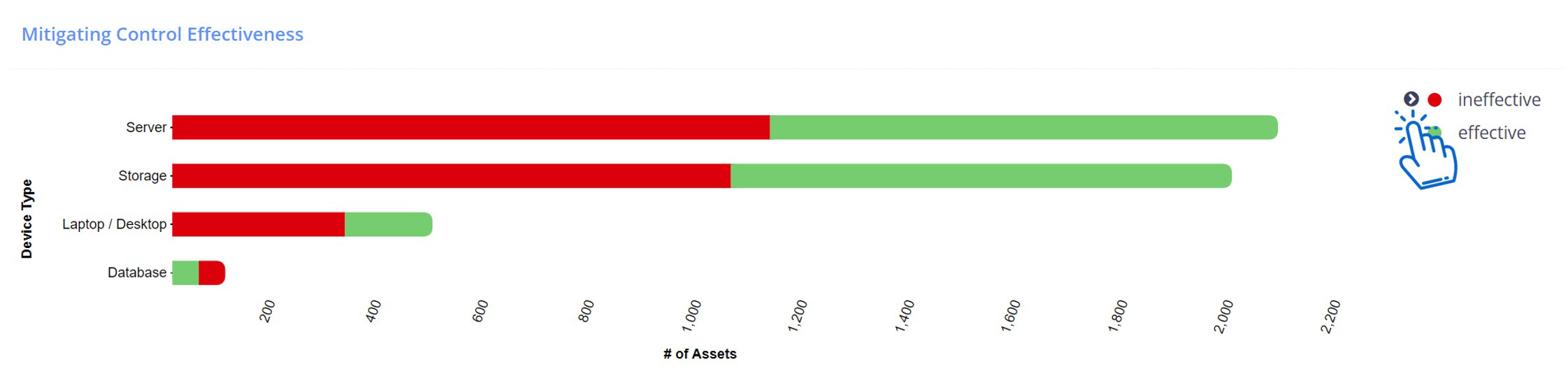
Visual Modifications
To hide or display the visual tile legend, click on the small arrow (highlighted in hand cursor below). To preserve the setting, click Update Dashboard (see above).
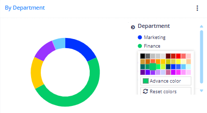
To change the color of the graph value of each tile, right click on the value and select the desired color. To preserve the color edits, click Save.